生活之态
时间:2019.1,24--
地址:深圳宝能时代湾海湾文化中心
以家的概念为灵感,由主展区和四个相对独立的分展区营造情境,呼应不同主题,围绕生活设计相关之物,连接起新与旧、传统与现当代,提供关于生活的美好想象。
Inspired by the concept of home, the exhibition is set up as one main section with four relatively independent subsections to create different situations corresponding to different themes. The exhibits revolve around the design of daily objects, seeking connections between the old and the new, the traditional and the modern and aim to project a vision of ideal living.
平面设计与海报
展览表达的是符合当代中国语境下的生活之态,平面设计也是希望能够传递这样一种继往开来而又符合中国生活的思考。
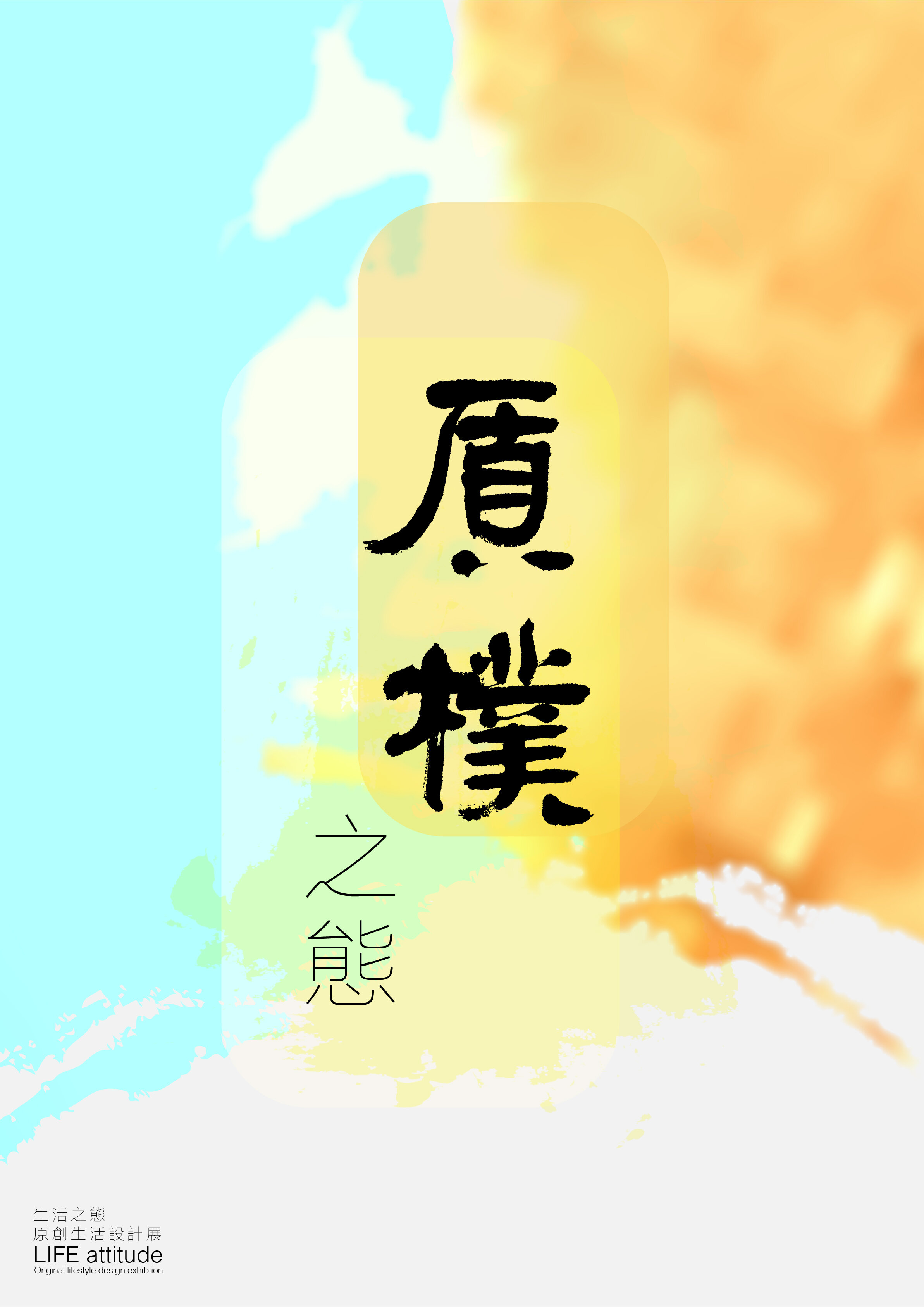
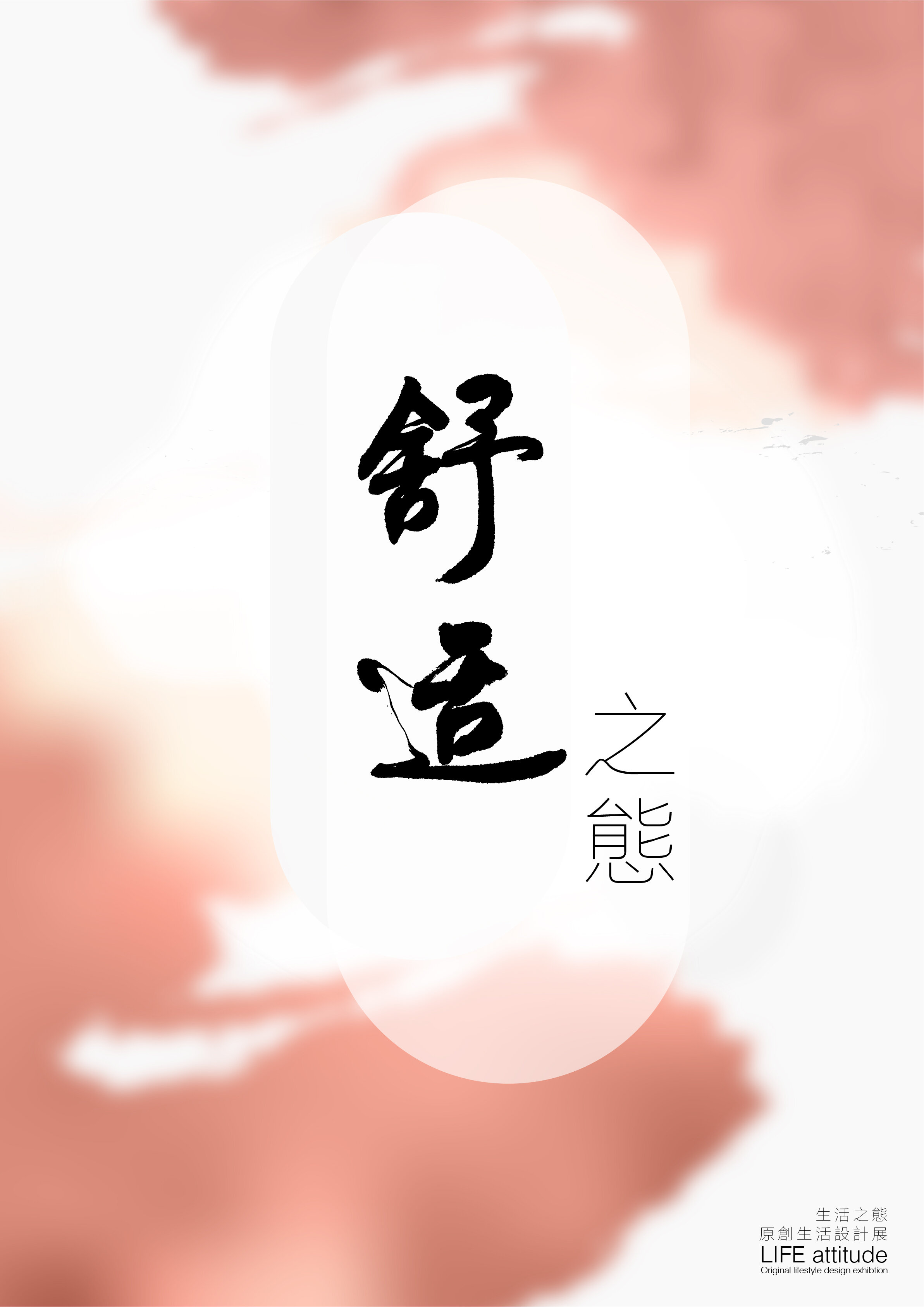
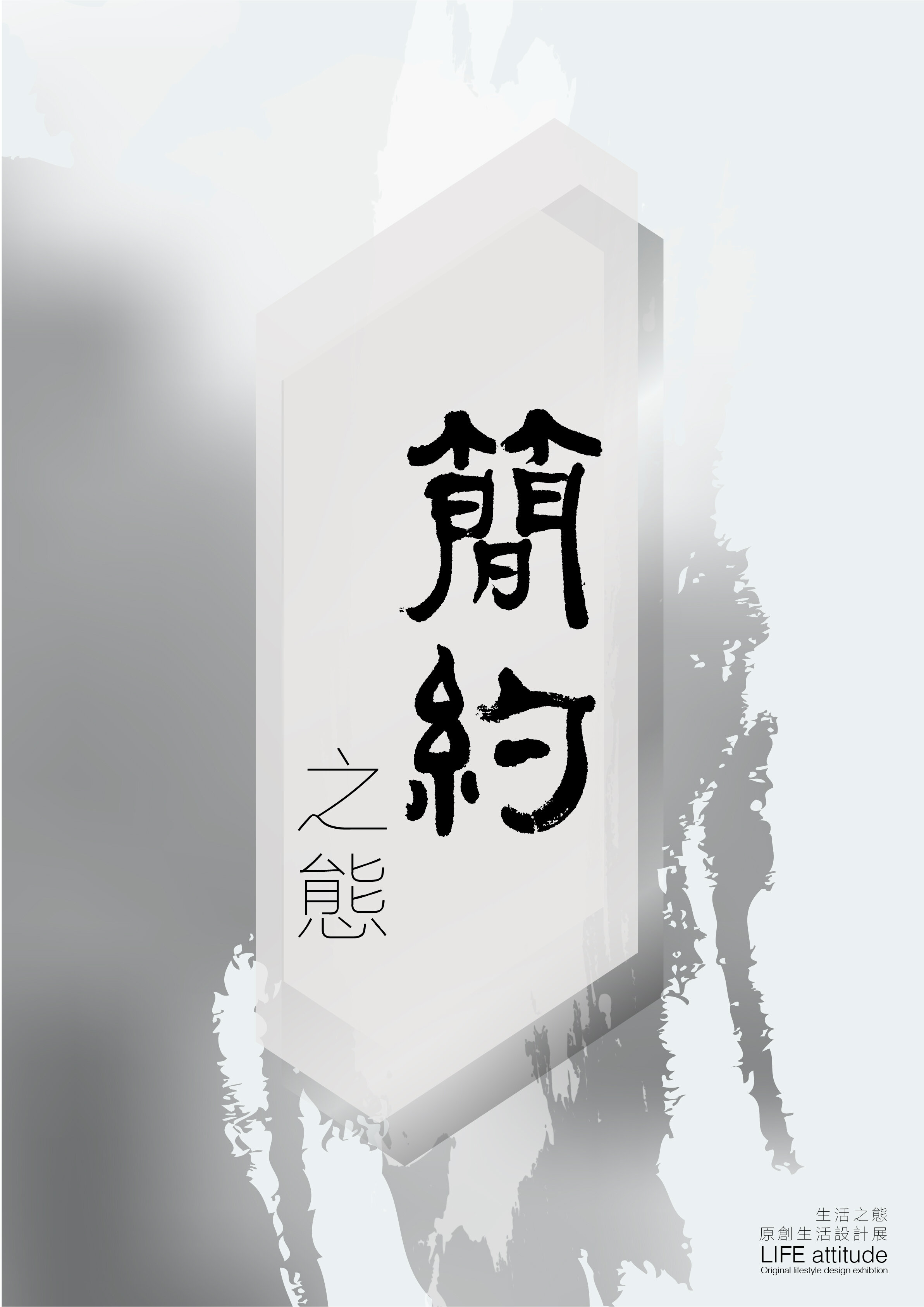
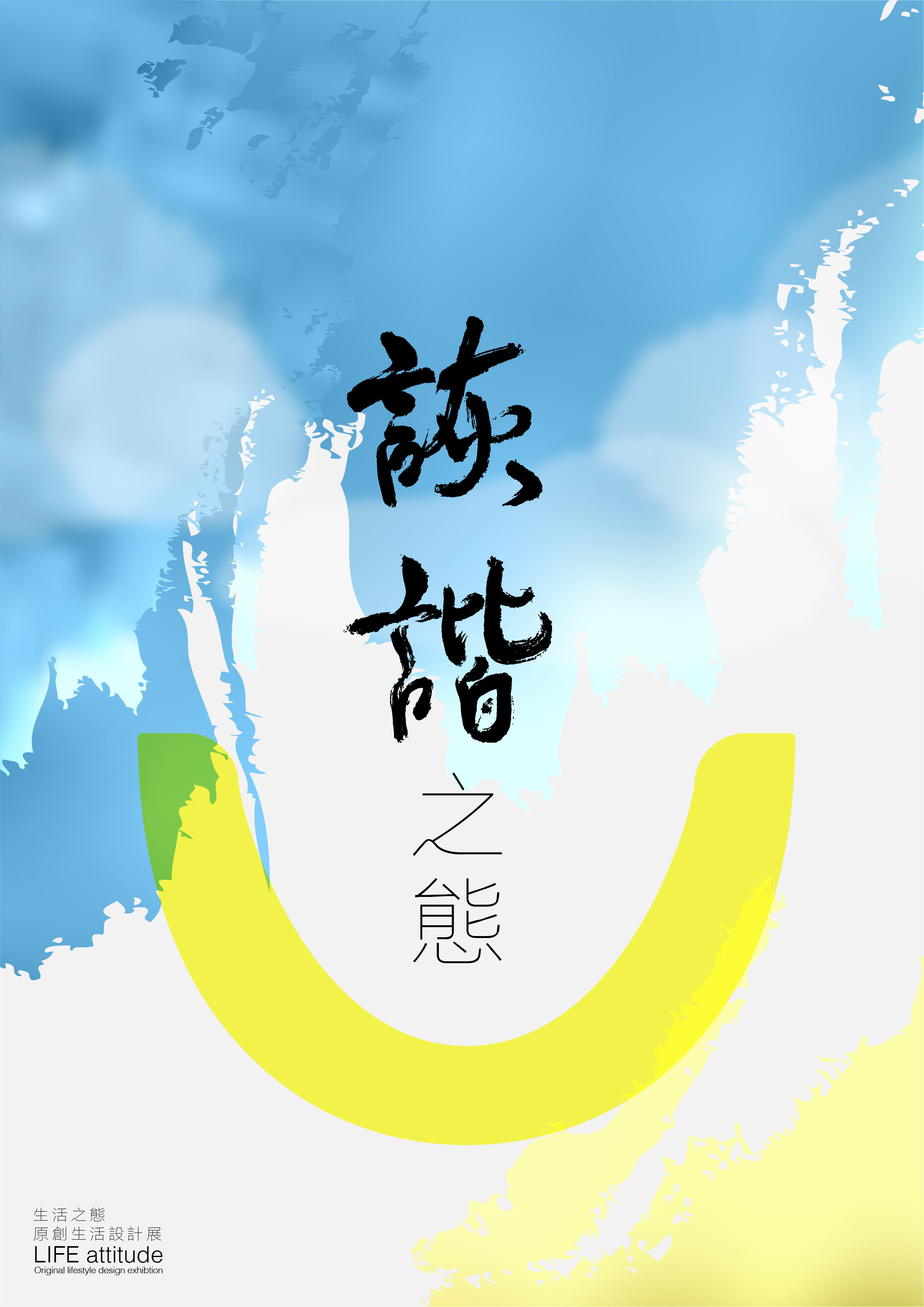
设计用手写行书和色彩晕染结合的水墨意象,构建出中国风的视觉体验,同时,为了增强与当代生活的联系,使用了具有延伸感的规则线条穿插其中,并在印刷字体的选择上统一选择了衬线宋体和对应的衬线英文字体,呈现富有文化积淀,而具有时代特征的质感。
为了配合不同展区的策展主题,分展区海报使用了不同的手写书体。
水墨晕染效果也根据展区形式进行调整:
质朴——单纯墨迹
舒适——褪晕环绕
简约——笔刷
诙谐——笑脸
这四种不同的中景效果构成,与各展区的主题相呼应。


展览介绍
生活姿态,是可以被定义的吗?以此为题,我们希望抵达每个不同的个体,并尝试通过对触手可见的物进行空间营造,将不同的精神层面转译出来。
质朴、幽默、简约、舒适,这些词语背后有着丰富的内涵,恰如新与旧、现代与传统、高科技与环保风,同样可以在当代生活中寻找到共融的表达语境。
以家的概念为灵感,由主展区和四个相对独立的分展区营造情境,呼应不同主题,围绕生活设计相关之物,连接起新与旧、传统与现当代,提供关于生活的美好想象。
展览是个小舞台,咫尺天地汇聚本土年轻设计师们的力作,也撷取经典设计、怀旧良品,一一呈现眼前。
生活的姿态是多样的,我们相信,每个人以自己的感受和行动,来为其写下注解。
Introduction
Is the attitude of life definable? With that in mind, we hope to affect various different individuals, and via the recreation of space with tangible materials, to translate different aspects of diverse mentalities.
Rustic, humorous, minimal and comfortable, these words have multiple layers of connotations. In contemporary society, we often find the co-existence of different expressions, like old and new, traditional and modern, high-tech and ecological.
Inspired by the concept of home, the exhibition is set up as one main section with four relatively independent subsections to create different situations corresponding to different themes. The exhibits revolve around the design of daily objects, seeking connections between the old and the new, the traditional and the modern and aim to project a vision of ideal living.
The exhibition is like a miniature theatre. It is a collection of great works by young local designers, with classic designs and excellent vintages, presented one by one in a close space.
The attitude of life is diverse. We believe that every one should express their personal outlook with their own unique feelings and actions.


